
AI Visibility Monitor landing page review
Higher than 42 of the 60 other launches on the public record, level with 2 (70%)
“The page is clear but lacks visual proof and urgency, forcing users to click away to see value.”
What we read, 27 Sept at 20:23, at laptop width.
Fix these 3 first
of 5 we found- 1the visitor sees the solution before they are reminded of the specific problem they are solvingCostlyup to +6.8
- 2the target user only realizes the tool is for them after scrolling to the pricing tableCostlyup to +3.1
- 3a visitor must leave the page to see if the UI is professional or a basic text listCostlyup to +6.8
The numbers
This page, in numbers.
Its four scores against the public record, its public grills over time, and what we measured. The measured numbers sit beside the score, never in it.
Its four axes
- ✓passed:P1Exists
- ◐half:P2Specific
- ✕missed:P3The product is visible
- ✓passed:P4Honest for the stage
P3, missed: No screenshots of the actual dashboard or reports on the landing page.
Choose an axis to read it.
Where 68 sits
42 of 60other launches score lower
The public record, 19 Nov: each launch counted once, by its latest public grill.
Its public grills
2 publicsince 27 Sept. The best was 92.
Hollow dots: an older rubric, so not comparable one to one. Private grills are left out: only the owner sees them.
What a stranger sees first.
Before scrolling, on a laptop and on a phone.
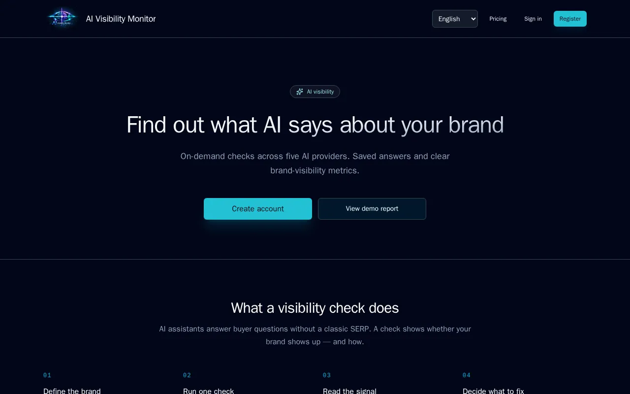
Your message, as a buyer reads it.
Four questions, in the order a buyer asks them. Each fix quotes your page and ends in something you can do today.
1. Do I get what it is?
Clarity 100Nothing to fix here.2. Is it for me?
Audience 392 of 4 tests pass.“AI assistants answer buyer questions without a classic SERP”
the visitor sees the solution before they are reminded of the specific problem they are solving.
Proposalyou decideMove this sentence to the first viewport as a pre-headline or a lead-in to the main headline.“First paid pack for a marketer or solo operator”
the target user only realizes the tool is for them after scrolling to the pricing table.
Proposalyou decideExplicitly name the target user in the first viewport, e.g., 'For brand managers and SEOs'.
3. Do I want it?
Offer 644 of 5 tests pass.“Plans section”
there is no incentive to buy today, leading visitors to bookmark the page and never return.
Proposalyou decideAdd a limited-time launch discount or a 'first 100 users' bonus to the paid tiers.
4. Do I believe it?
Proof 392 of 4 tests pass.“absence of product images”
a visitor must leave the page to see if the UI is professional or a basic text list.
Proposalyou decideAdd a high-resolution screenshot of the visibility score and sentiment dashboard in the 'Read the signal' section.“absence of testimonials or case studies”
the product relies entirely on a demo, lacking evidence that it provides actionable business value.
Proposalyou decideAdd one specific 'Before/After' example showing how a brand improved its visibility after a check.
- Keep: The one-time check pack model with no auto-renew is clearly explained and removes significant purchase friction.
- Keep: The 'View demo report' CTA provides immediate, low-friction access to the product's core value.
Your score in detail.
Level 3 of 4 Cooked
- ✓First grill
- ✓Cooked — reached 60
- ✓Well done — reached 80
- ✓Before and after — finish round 2
Clarity35% of the score5100
Audience18% of the score21139
Offer29% of the score4164
Proof18% of the score21139
Every grill of this page
- 1 of 268Cooked27 Sept 2026You are here
- 2 of 292Well done1 Oct 2026+24
Your launch, read the same way.
Free. No card.
Ready to launch? The Launch Kit: your agent submits you to up to 84 free directories · $49 →