First grill
Six things to fix before launch day.
6
to fix
2
strengths
10
Raw
Round 1 of 2
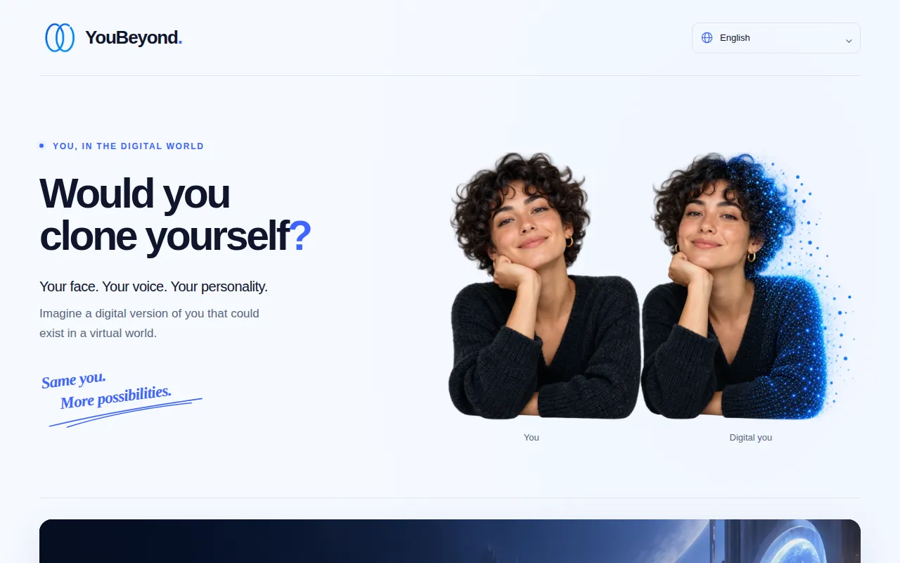
What we read · 16 Oct, 08:43
“The page is a philosophical inquiry, not a product launch, leaving visitors with nothing to buy.”
Level 1 of 4 · Raw
30 points to Undercooked
all open: 43
now 10
Raw 0–39UndercookedCooked 60Well done 80
6
locks on this page
+33
points in reach
43
could reach · Undercooked
Badges
- ✓First grill
- Cooked — reach 60
- Well done — reach 80
- Before and after — finish round 2
What will go wrong on launch day
Fatal · they leave before they understandCostly · they understand and still leaveDrag · it works, and could work better
- Potential problem
“"Would you clone yourself?"”
A visitor does not know if this is a software tool, a movie, or a survey and leaves.
Proposalyou decideAReplace the headline with a category-defining statement, e.g., "The AI platform to clone yourself." - Potential problem
“no pricing anywhere on the page”
The stranger cannot determine if this is a commercial product or a free experiment.
Proposalyou decideAAdd a clear offer, such as "Join the free beta" or a pricing table. - Potential problem
“no audience named”
The page appeals to general curiosity rather than a specific buyer's need, killing conversion.
Proposalyou decideAExplicitly name the target user, e.g., "For creators who want to scale their presence." - Potential problem
“”
The use of conceptual art instead of a UI makes the product feel like vaporware.
Proposalyou decideAReplace the hero illustration with a screenshot of the actual product interface. - Potential problem
“"More possibilities."”
The visitor sees a vague adjective instead of a concrete result they can value.
Proposalyou decideAReplace with a specific outcome, e.g., "Be in ten places at once." - Potential problem
“"Explore the possibilities"”
The CTA is too vague to signal exactly what happens after the click.
Proposalyou decideAChange the label to "Watch the Demo Video".
Don’t break these
The visual aesthetic is clean and professional.
The "No signup. No cloning" text effectively reduces friction for the poll.
The four axes
Every point comes from a test. Open a row, or read the rubric.
Clarity35% of the score21225
212
2 passed · 1 partial · 2 failed → 25. Weighted at 35%, this contributes 8.8 of the overall 10.
Audience18% of the score40
4
Offer29% of the score144
14
Proof18% of the score132
13
8.8 + 0.0 + 1.2 + 0.4 = 10.3 → 10.
Full page read.
This grillShareShare the score
Grill your launch before your customers do.
Free. No card.