First grill
Six things to fix before launch day.
6
to fix
2
strengths

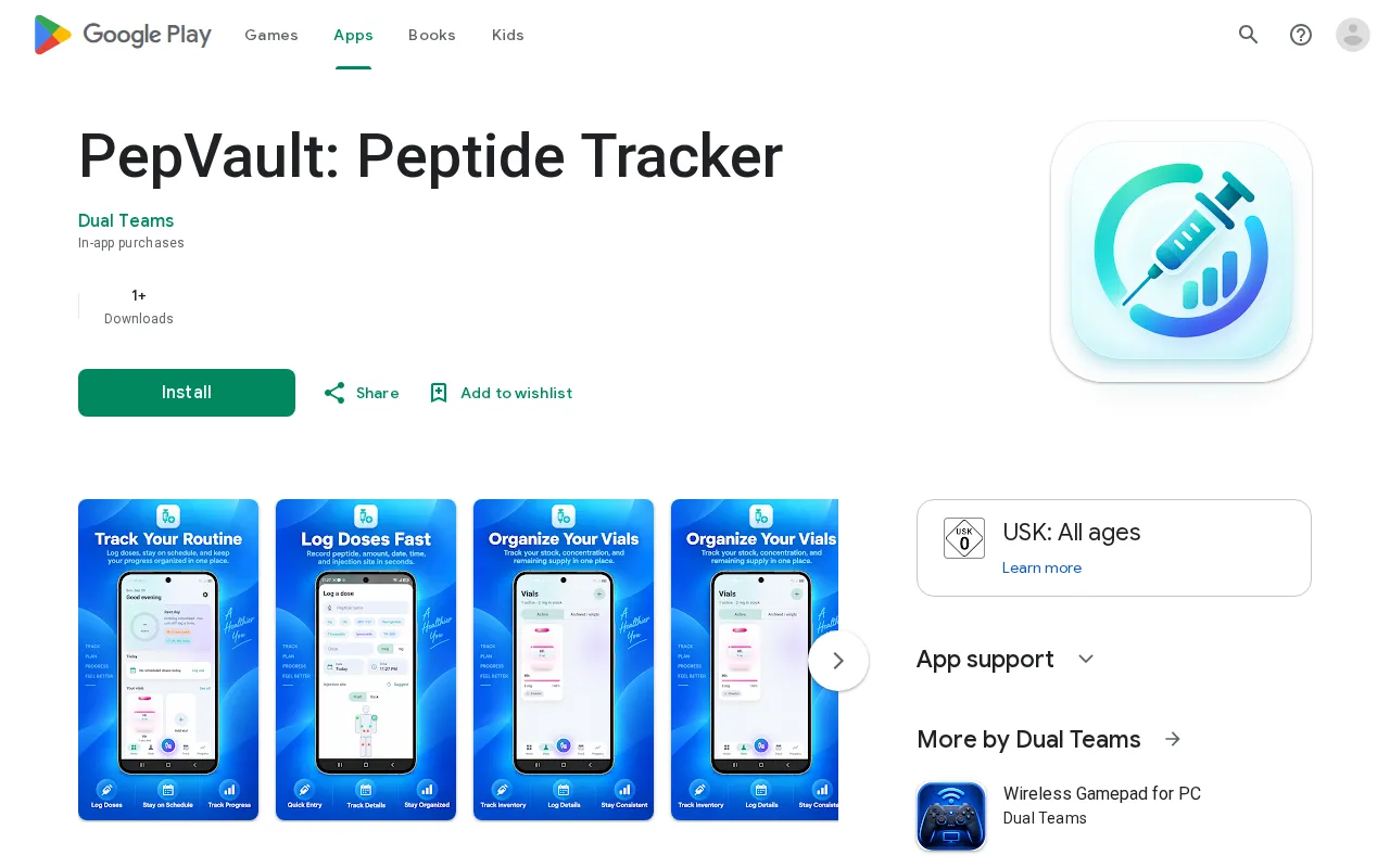
PepVault: Peptide Tracker
Visit play.google.com/store/apps/details?id=pepvault.peptide.tracker27
Raw
Round 1 of 2
What we read · 8 Oct, 06:05
“The page lists features but hides the price and the pain, making the value invisible.”
Level 1 of 4 · Raw
13 points to Undercooked
all open: 74
now 27
Raw 0–39UndercookedCooked 60Well done 80
6
locks on this page
+47
points in reach
74
could reach · Cooked
Badges
- ✓First grill
- Cooked — reach 60
- Well done — reach 80
- Before and after — finish round 2
What will go wrong on launch day
Fatal · they leave before they understandCostly · they understand and still leaveDrag · it works, and could work better
- Potential problem
“"In-app purchases"”
A visitor does not know if the app is $1 or $100/month and leaves to avoid a surprise.
Proposalyou decideAList the starting price or 'Free to start' explicitly in the first paragraph of the About section. - Potential problem
“First viewport”
The visitor sees a name but no result, failing to understand why they should care before scrolling.
Proposalyou decideAAdd a short tagline to the first viewport, e.g., 'Stop guessing your doses and organize your vials in one place.' - Potential problem
“"No more scattered notes or spreadsheets"”
The only mention of the user's pain is buried at the bottom, making the solution feel irrelevant.
Proposalyou decideAMove the 'scattered notes' pain point to the very first sentence of the About section. - Potential problem
“"1+ Downloads"”
The lack of any verifiable user success makes the app feel untrusted or abandoned.
Proposalyou decideAAdd a specific testimonial from a beta tester describing a problem the app solved for them. - Potential problem
“About this app section”
The copy is generic; a visitor doesn't know if this is for medical patients or biohackers.
Proposalyou decideAStart the About section by naming the user: 'For biohackers and patients who need to...' - Potential problem
“"simple and powerful"”
These adjectives are empty and tell the buyer nothing about the actual user experience.
Proposalyou decideAReplace 'simple and powerful' with a concrete fact, e.g., 'Log a dose in three taps.'
Don’t break these
The screenshots clearly show the actual product interface.
The medical disclaimer is thorough and professionally stated.
The four axes
Every point comes from a test. Open a row, or read the rubric.
Clarity35% of the score3236
32
3 passed · 0 partial · 2 failed → 36. Weighted at 35%, this contributes 12.6 of the overall 27.
Audience18% of the score2225
22
2 passed · 0 partial · 2 failed → 25. Weighted at 18%, this contributes 4.5 of the overall 27.
Offer29% of the score141
14
0 passed · 1 partial · 4 failed → 1. Weighted at 29%, this contributes 0.3 of the overall 27.
12.6 + 4.5 + 0.3 + 10.1 = 27.5 → 27.
Full page read.
This grillShareShare the score
Grill your launch before your customers do.
Free. No card.